
The thing about brilliant apps is that you don’t even notice how brilliant they actually are. It is always the hiccups and the problems with the design of the app that gets our attention. If you are planning to come up with a fabulous app, you are going to have to have a designer who would have a deep knowledge of devices, an understanding of user psychology, and a willingness to abandon all that has been learnt and then start from the scratch.
The thing about a typical app user is that they are not going to engage with an app that has been designed poorly. Also, did you know that a whopping 77% of the app users uninstall the app within 90 days of downloading it.
Whether you are designing your app yourself, or are hiring someone to do it for you, it is important that you are aware of some of the most common mistakes that need to be avoided. So, here are the most common design mistakes that people make and that you should avoid!
#1 Ignoring the Use of the ‘Thumb’
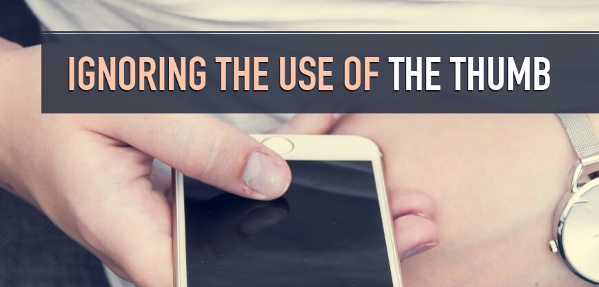
Most of us use only our thumbs to navigate through the app, and if the app you design requires any actions that require more than the thumb, it is going to be a cumbersome experience. It is important to pay attention to the area of the screen that is accessible for a normal sized thumb. This zone varies according to the screen size, which means that while you are trying to optimize your app for various devices, you would have to take care of this.
As Apptentive mentions before in their article, it is important that you prioritize the most used elements of the app in this thumb zone because it is impossible to accommodate everything in this area. The study conducted by UX matters establishes that of the total number of people who use their phone with a single hand, 67% use their right-hand thumb. However, simply because there are fewer left-handed users, we can’t possibly ignore them completely.
How To Avoid?
This needs to be taken care of right at the development stage by carrying out thumb mapping which would give you a visual map identifying the areas that can be accessed by a single thumb. Make sure that your CTAs are placed in this area.
The second point here is to pay attention to the size of the buttons. If they are too big, the design looks ugly, and if they are too small, they become unclickable. The ideal size of the button would be in the range of 7 to 10 mm.
#2 Inconsistencies in Aesthetics

The style and design of every UI element whether it is the button, the text, images or anything else must have some sort of consistency. This article by Design Shack tells us why maintaining consistency in the aesthetics of your app is so important. Though some of the buttons you come across might be really trendy and cool, but if they do not fit in with the overall design or colour theme, but using them mindlessly is going to mess up the overall look of the app and confuse the users as well.
How To Avoid?
If you are looking for an aesthetically consistent design for your app, and are trying to enable seamless movement from one colour or typography or any other design element to the others, it is better that the visual progression move from heavy to light!
#3 Not Providing App Walkthroughs
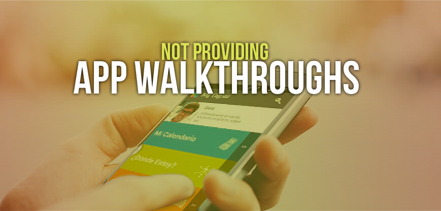
While it might be expected for the app to be intuitive enough for the users to navigate through without any walkthroughs, but as the functionality of the apps gets increasingly complex and diverse, in recent times a proper walkthrough is being appreciated by the users. According to Telepathy while deciding if or how you are going to execute a walkthrough, you must remember your target users and their usage patterns. In the struggle to balance functionality with ease of use, precisely executed walkthroughs can prove to be of great use.
How To Avoid?
While developing your walkthrough, remember to make them engaging, visually appealing, and most importantly give your users an out, which means it should be optional.
#4 Cognitive Overload

Have you ever visited an app and felt like you were finding it stressful to keep up with it. Marvel blog here mentions that the moment you open an app, there is learning initiated in the brain for every action as you try and navigate, process the layout, or take in all the visual elements on the screen. The effort that your brain puts in doing this is called cognitive load. However, if the information presented to your brain, at any point of time exceeds the amount that it can handle, the brain might either slow down or abandon the task, which here means your app.
How To Avoid?
There some techniques like progressive disclosure technique, minimizing the number of design elements and using microcopies, that can help you reduce the cognitive load while still maintaining an engaging and rich user interface and app design.
#5 Doing Exactly what Others are Doing

While looking for inspiration, it is not uncommon for designers to cross the line and step into the pitfall of plagiarism. While doing a competitor analysis, it is important to keep an eye on the real picture and not get carried away, like Usability Geek explains here. While it is important that you really know and understand your competition and maybe even pick up a few elements from those who seem to be doing it right, but when you end up cloning the app to the tee, you become a cheap knock off of a better app.
How To Avoid?
Conduct deep competitive research, analyze what they are doing right, use it in combination with your own ideas. Apart from this, you can also keep an eye on their flaws, so you know what mistakes to avoid, and how to improve upon them to make your app superior.