The choice of colors for your brand and for your app are dependent heavily on the kind of goods and services that you are planning to sell, the target consumer who you are selling to, and the way you want the audience to feel when they visit your app or are exposed to your brand and look at all that you have to offer.
If you were to choose your colours randomly based on personal likes and dislikes, you would probably end up misleading your audience. This means that not only the people who come to your app would be expecting to find a completely different line of products, but also that the real target market might not even get attracted to what you have on offer. This means the app that you designed so painstakingly would not find exposure to the kind of audience you designed it for!
Let us take the example of the iconic automobile brand, Mercedes-Benz. The targeted clients for the brand are those who are looking for sophistication, kind of an understated power with class, which is why they chose their website and brand colours to be a combination of Black with White. Eternally the colours of dignified sophistication with a unique authoritative power associated with them, the classic combination of black and white are the perfect choice for them.
Knowing this, imagine the website, their brand image, and their identity being reformulated in red and yellow. How do you feel about it now? What impression would their target consumers have of the brand, and would they pursue the brand further?
Like we mentioned earlier, the brand Mercedes-Benz is associated with sophistication, class, elegance, the rich, and exudes a kind of understated power. Every brand needs a personality of its own, and this personality needs to shine through the colours that the brand chooses to use on their website, app, or any other channel. In today’s scenario, there are primarily 5 different brand personalities that are prevalent internationally – Sincerity, Excitement, Competence, Sophistication, and Ruggedness.
Now let’s get into a hypothetical situation where Ann is planning to launch a range of cosmetic products that would add glamour to women’s personalities.
Here, the target audience consists of women. However, the target is not all women, it is only those women who aspire to look glamorous. Hence Ann would have to look for colours that are glamorously evocative. This is the time to choose colours for the brand. The colours Purple and Black are poignantly glamorous. Ann goes on to choose Purple for her brand identity, this means that on her app, the primary colour of focus needs to be Purple.
This is how you need to choose colours for a brand that would attract just the right kind of people to your app, and thus enjoy a higher conversion.
Tools that can help
After going through the immense amount of impact that you can bring in through optimum and informed use of colour in your app design, you can now start having the fun of your own! It is a lot of fun exploring different combinations and you can create an app colour theme the way you envisioned it. However, you are going to need the help of some tools that can help you get there.
Material.io
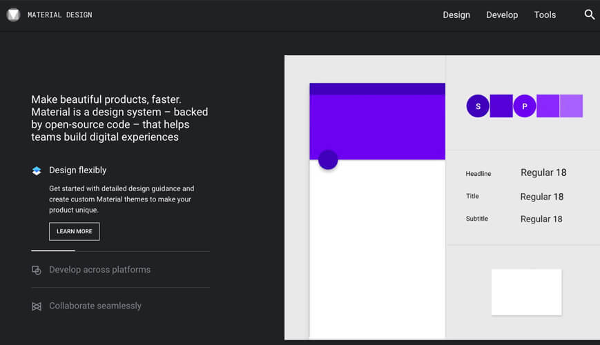
Yes, the tech giants come to your rescue here too! The Material Design Guidelines from Google are intended to bring out a cohesive group of ideas for the way it wants the developers to approach the myriad aspects of the design of their app, whether it is the basic layout or about using animation in an effective manner. It is as a part of these guidelines that Google also offered certain ideas about the best ways to use colour.
It is only last year that Google began expanding on the advice they offer on colour and colour themes for apps and launched a great new colour tool. This new tool is meant to help the developers and designers pick the right kind of colour palettes for the app that they are developing for a brand, business, or service.
This unique tool would help you, as a developer create your own colour palette and share it too! However, what truly makes it interesting is that the tool offers you the ability to apply this colour scheme to a sample user interface and to a number of material design components in CodePen which is kind of a third-party ‘Playground’ for the front-end web developers!
In addition to all these cool features, this unique tool from Google automatically evaluates the legibility of the text for the particular colour palette you chose for your app design. This evaluation is in accordance with the Web Content Accessibility Guidelines. The primary focus of these guidelines lies on the contrast between the colour of the text content and the background colour so that people with varying degrees of visual impairments can read better and with ease when they are using your app.
Coolers.co

As you begin playing around with different colours, this can prove to be an exciting space where you can play around with a great variety of colour options in their colour palette. You can keep exploring the tool until you find exactly the colours that you have your heart set upon. After you have decided upon the colours that you find suitable, you can then export this final chosen colour in a whole variety of formats, in order to figure out, how they look on a wide variety of platforms, screens, materials, etc.
What’s more, Coolers.co also offers those who are struggling and are in need of some inspiration! They have a library of complete creations that you can browse through so that you can draw some inspiration from it, and maybe identify some sort of a starting point in your process of deciding the colour theme for your brand and the mobile app that you are building for it!
Colourcode
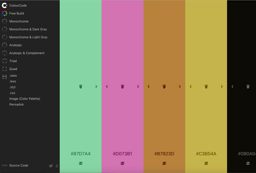
Colourcode has one of the most interesting approaches to creating a palette for your app. The moment you land on their homepage, you have the freedom to pick any colour you want, yes, any colour you want! The screen is highly interactive and lets you create a vertical palette that you want to opt for your brand and for your app. You can move your cursor around and a host of numerous options would be showcased for your benefit. Before you pick any colour, you have, before you a whole lot of options that can help you refine your choices, so you have an entire playground in front of you to go nuts with!
Canva Color Palette Generator
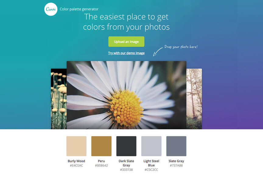
This is one of the more versatile design tools that you might want to keep in your arsenal. What’s great here is that you can identify the particular colours that you already have a liking for and utilize them for your app & design. It might be so, that you came across a particular image or a photograph that you think will be great for your brand image, identity and your app design. Here, you can simply upload the image on the colour palette generator and instantly have the entire palette of colours presented to you with details. They make it even easier for you by giving you the hex numbers so that you can have the entire information with you and can make use of it, going forward.
Kuler
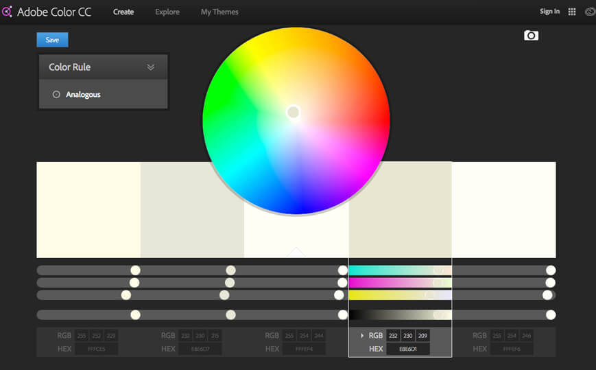
The fact that Kuler comes from Adobe, speaks volumes about the quality it is going to have an offer for its users. This tool actually spoils you for choice! There actually are an infinite number of options for colour themes to browse through. Most of these were created by the users who came exploring and left behind a piece of their work to inspire you. The scope of experimentation with colours at Kuler is massive and you can create any combination that takes your fancy. There actually is no limit here, except maybe your imagination!
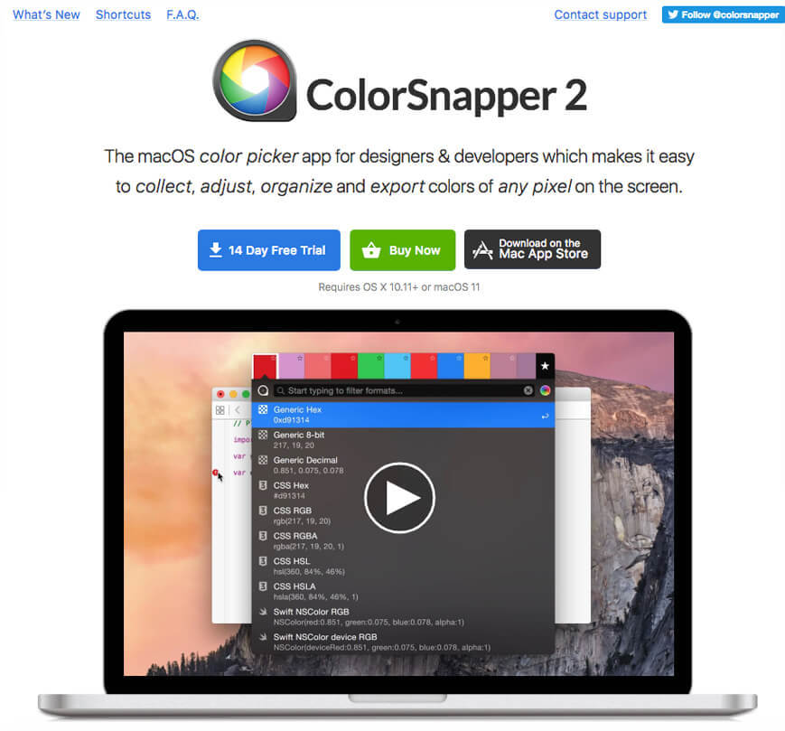
ColorSnapper
In spite of a huge range of tools available for designers to pick from ColorSnapper has stayed among the most favoured and the most popular colour pickers. This is definitely not without reason. The Mac app is amazing in itself, as it lets you quite efficiently and promptly make use of a magnifying colour picker. The fun part is that this unique colour picker can be used on anything that you might see – whether it is online or off!
The colours that you so painstakingly pick with ColorSnapper’s colour picker are then stored in its colour panel and is ready to be used later, whenever you might need it. The moment you want to copy this colour that you stored, all you have to do is click on it and it would be instantly copied on the clipboard, ready for you to use!
Webflow Chrome Extension
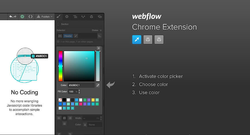
How can we not talk about this? The Webflow Chrome extension has a nifty little in-Webflow colour picker. This colour picker allows you to pick any colour from within your own project. This means you can pick a colour from all your brand material like your logo, an illustration, or a prior photo shoot, without having to navigate out of the app or switching between interfaces! Now, isn’t that cool? Once you have managed to grab the colour, it is super simple to make a global swatch out of it. This global swatch can be promptly and easily reused all across the site! Isn’t that something now!
Brandmark’s Color Wheel
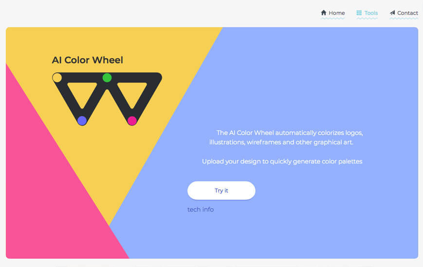
Now, this is a tool of the future! Brandmark’s Color Wheel makes use of AI to automatically colourize different elements like your logo, myriad illustrations, schematic wireframes, or any other graphical art that you plan on using while designing your app. All you need to do is upload your design and your colour palette would promptly be generated to use and apply as you please. Not only is this a really cool and futuristic design tool but can serve as a really rich source of inspiration. The moment you upload a flat design on it, you have, in front of you literally thousands of unique colour variations to browse through and pick the one you find best suited to your brand’s identity.
