
The evolved app users today are looking for simplicity, which is why the developers are opting for minimalistic design options.
Essentially a minimalistic design consists of the bare essentials or the most basic form of design. It can only be achieved when the user interface on the app is devoid of any non-essential feature or element. Doing so would definitely narrow the focus and when the developers are only using limited graphic elements, the users would find it easier to use it.
Key Elements of a Minimalistic Design
This is where form and function come together in perfect harmony. The user interface and the experience that is offered by the app is the main driving factor in getting people to actually use it. The app must not only be functional but also be aesthetically pleasing and easy to use and minimalistic design has been proven to achieve it.
1. Simple Color Schemes
When you opt for the simpler colour schemes, it directly improves the user experience and thus enhances the overall app stickiness.

A majority of the immensely successful apps have opted for a monochromatic or analogous colour scheme.
2. Monochrome
A monochromatic colour scheme typically consists of various shades, tints, and tones of the same chosen hue. Opting for a monochromatic colour scheme lets you, as a designer include a number of colours without wreaking havoc on the aesthetics.

Of the popular apps, Facebook, LinkedIn is known for making good use of the colour blue in their design. It definitely works! Blue is a colour that is wildly popular and one that you can opt for if you are not pre-disposed to a particular colour.
3. Consistent Typography
The typography that you pick, can define the kind of user interface you build and the experience that a user would have with your app. It is so important that Apple App Store includes it in its guidelines and recommend using just the one kind of typeface. Within an app mixing up more than one kind of font can make it look sloppy and disorienting.
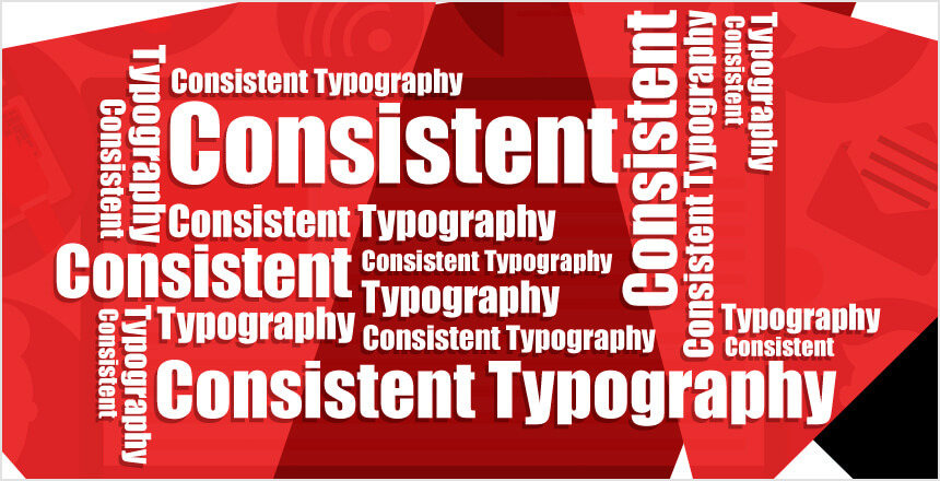
As you are trying to figure out the typeface for your app, it is important that you try out different font types, in different sizes, keeping in consideration the spacing and the font length to achieve the best results and making the font readable.
4. Intuitive Navigation
They might not seem like much, but the navigation icons carry a huge amount of weight and value when it comes to the overall usability of the app. The navigation icons within the app must be found and understood easily.

A magnifying glass icon is universally accepted as the search icon, using something else might only confuse the customers. Similarly, a shopping cart or a basket icon is supposed to lead you to all that you intend to buy, assigning this icon for something else would be grossly misleading.
5. Using Whitespace
Whitespace or the negative space is the most critical design element when it comes to creating a minimalistic interface and design. This is essentially the portion of any page that is left blank or empty with the intent to create contrasts, helping other elements to stand out.
Though devoid of any colour, whitespace can prove to be quite critical as a design element. It is the ability of the designer to use whitespace in a favourable manner that makes the UI unique, setting it apart from their competitors.
Minimalistic Design Increases App Stickiness
For an app to get any success in the long run, it must entice the users to come back to them again and again. Stickiness is essentially an apt metric for measuring the popularity and is determined by dividing the number of daily active users (DAU) by the number of monthly active users (MAU).
The idea is to achieve a high stickiness ratio which is a sign that the users simply can’t get enough of the app making them come back to it again and again.

One of the most successful examples is Instagram. It is one of the stickiest apps and its minimalistic design has a lot to do with it. The app is one of the most easy-to-understand apps today and needs just but a glance to be understood. The app uses plenty of whitespaces minimizing any kind of distraction and direct all focus on the content that the users were uploading to the app. Instagram tells you to:
- Keep it simple
- Give a minimum number of options
- Help them onboard quickly
- Let Menus and Navigation be crisp to motivate users to stick around
Looking Ahead
The app developers are paying attention to the minimalistic design approach which emphasize more on navigation and content instead of elements that are merely decorative. This trend of minimalistic design is still on a upcurve with no signs of slowing down. If you open up any of the popular apps on your phone right now, you would see a number of elements of minimalistic design scattered all over them including an elegant typeface, judiciously used whitespace or others. While designing an app for today that would last for a long time in the future, it is important that you learn to incorporate a minimalistic design, so that the interface has the ability to satisfy the app users.
Use this trend to your advantage, not as a mindless trend, but as a principle for good design to provide seamless interaction and lead your app on the way to success.