
So you have a great idea for an app and are raring to get the app in the market as soon as possible and get the app up and running. In such cases, in a hurry, most of the app owners and app developers tend to ignore one of the most important aspects of the app development process – the design of the app. The design of the app includes the aesthetics and navigation of the app primarily. The user interface and the user experience of the app play an important role in the success of the app. You are eventually building the app for your users and if they do not respond well, or do not like the UI & UX of your app, they are not going to come back to it, no matter how technically strong and fast, and responsive your app may be.
Whether you decide to go and publish your app on the App Store, Google Play Store or any other platform, there is going to be stiff competition and you would have to find a way to stand apart from them. In this overcrowded space, if you want people to sit up and take notice of your app, you would need to make sure that your app is remarkable in at least one way that matters to the users or your target audience.
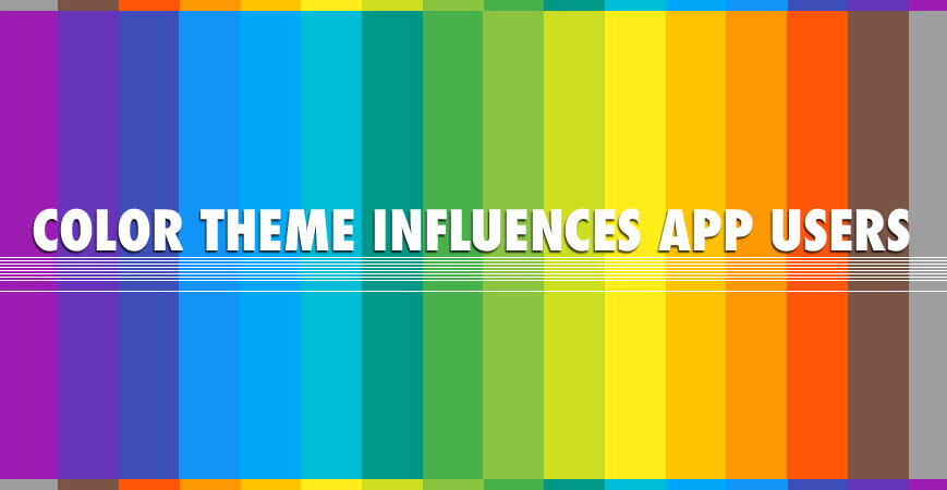
In this blog post we are going to talk about mobile app graphic design, the importance and impact of colour on users’ psychology, designing a logo, designing a splash screen, the latest trends in designing app graphics, and some cool tips for designing mobile app graphics.
1. Introduction
“The first impression is the last impression” might sound like a cliché to most, but it holds true to the tee, especially when it comes to mobile apps. One of the best ways to make your app stand out and cast a stellar impression is by applying a fabulous creative design on it, that is the aesthetics part of app design. The users or the targeted users, look at the app design even before they download the app. No matter how much of a rush you might be in, it always pays to spend some time working on improving the visual appeal of the app.
When it comes to the aesthetic design there are certain basic elements of design that must be considered viz. Color, Line, Shape, Texture’ Space, and Form. However, when it comes to the design of a mobile app, it is the colour theme that takes the highest precedence.
What comes to your mind when you see a red cola can from a distance or big yellow arches, or a half bitten silver apple? If you are like most other people and have even a little bit of awareness, you have already associated Coca Cola, Mc Donald’s, or Apple with it. In all these cognitive relationships that you instantly formed, colour plays a big role. This is the one element that is predominantly responsible for brand identification & for brand association.
It is important that you understand that for a mobile app, the colour theme that you choose, is more than mere aesthetics, it is, in fact, it is one of the vital components that constitute the brand identity and the brand experience extended by your app.
When you set out to build your own app, it is important that you choose a colour theme that is correlated to your existing brand identity and the website if you already have one so that your transition is smooth across all channels. However, if you are all set to launch a new business from scratch and are planning to develop a mobile app as a part of your launch plan, then you need to pay special attention to the colours you choose and what they say about you, your business, and your mobile app.
2. Color & Branding
When used efficiently, colour wields a lot of power. It can turn into one of the most effective and impactful modes of communication. Like we talked earlier, we have the ability to immediately recognize or identify with a brand just by looking at a certain colour on the product, and we do not even have to try! The ability of the colours to convey any particular message is more universal and faster than words. This means whenever you see a bright yellow, you are going to associate it with happiness, you see blue and you are going to automatically think of calm, peace, stability, and black would speak of power. This means a product that has yellow as a predominant colour in its branding is going to exude energy and bounce, and cheerfulness. In case you choose to go with blue, you are going to help your users feel calm and help them relax.
When you are a business owner who is in the process of picking up their colours, you would have to look into and leverage the colour psychology before you go ahead and choose your colour palette or colour theme for branding and then your app.
The role colours play in branding can be demonstrated further with the example of the fast food industry to understand the influence of colours. It is also important that you understand that the choice of colours need to be a little adaptable and should change if the general opinion of the target market. There was a time when this market was only flooded with reds and yellows that symbolized, speed, energy, efficiency – all qualities that you would associate with a fast food joint. In recent years, however, things have changed, and the industry has witnessed a shift.
The most obvious example here would be that of McDonald’s who were iconic in their use of the big yellow ‘M’ over a recognizable red background. In keeping with the recent change in trends, their branding while retaining the iconic M in yellow has a lot more greens and other natural colours. This change is in tune with the recent shift of interest towards healthy living. The new colours are chosen to extend the impression that the brand is offering fast food that is healthier than its competitors.
Green becomes a natural choice if your brand is all about nature, health, and wellbeing, which is probably what prompted McDonald’s to opt for the colour to fall in line with the current trend of people opting for healthier lifestyles and better eating habits. What Green is doing is that it is helping the consumers subconsciously believe that what they are eating is healthy, is sustainably sourced, and in general something that is ‘good food’.
2.1. Colors & the associations we form with them
Colours, like we mentioned earlier have a deep connection with our psychology and wield a certain influence over our emotions forming certain unique associations. Each colour represents different things and is known to lead us to varied emotional responses.
For fun, and for a better understanding let us try and understand what different colours can relate to.
- Red – The colour red is associated with warmth, rage, rusticity, exhilaration, power, strength, passion, love, blood, and all the extreme emotions. It is believed that red can provide impetus to impulse buying. History, however, associates red with royalty, majesty, triumph, but also with violence & blood. Emotional Response Red can be emotionally very intense colour. The colour has the ability to enhance the natural human metabolism, increase the normal rate of respiration, and to increase the blood pressure. The colour has a very high visibility, which is probably why objects like fire equipment, stop signals, and stop signal on the traffic lights are all red. Apart from this in the context of heraldry, red symbolizes courage, earning it a place in many flags.
- Yellow – Yellow, as a colour is associated with value, sunlight, joy, treachery, brilliance, and the Orient. Since this is the color often associated with the sunlight, it has come to symbolize cheer and springtime. The colour naturally claims a lot of attention and does that quite quickly. If anything it has the ability to surpass the high visibility that the colour red enjoys. Emotional Response Yellow has a spontaneous warming impact, bringing about a measure of cheerfulness, stimulating mental activity, and generating a kind of tangible muscle energy. Yellow is also the colour most often associated with food. Characteristically, the bright and pure yellow is kind of an attention getter which is why this is the colour chosen for taxicabs the world over. However, if you were to go overboard with this colour, you might only achieve unrest, which is probably why babies tend to cry more in a yellow room. In the context of heraldry, yellow is a colour of honour & that of loyalty, but ironically later the colour was associated with cowardice.
- Blue – Earmarked as a colour of knowledge and serenity, blue is known for its characteristics of coolness, offering an ethereal experience, representing the infinite, a sense of significance, repose, and formality. It oft represents the sky, the sea, and the ice. Historically the colour blue is used to symbolize truth, purity, loyalty, compassion, & serenity and this association continues to this day. Emotional Response The colour has a definite positive impact on the body and the mind. The color naturally slows the body metabolism, thus inducing a feeling of relaxation and calm. This is a color most often associated with tranquillity & peace. In context of heraldry, blue has always symbolized piety & sincerity.
- Purple – The colour of royalty – Purple has also always had a strong religious connotation to it. It is the fabled colour of the shadows, which is why it has had a bit of a mystery associated with it. Emotional Response This color brings together the inherent stability associated with the colour blue and the dynamic energy of the color red. The color exudes power, nobility, indulgence, and ambition. The color is also associated with extravagance and prosperity. Purple inherently suggests knowledge, dignity, independence, ingenuity, mystery, and magic.
- Orange – When red and yellow come together to form orange there is an abundance of light and heat. The color brings with it an immense pride and a certain ambition. The color is naturally associated with sunshine and warmth, thus bringing along cheerfulness.
Emotional Response The natural energy of red combines with the cheerfulness of yellow to form orange. The colour is most often associated with joy, sunshine, and especially the tropics! The colour orange exudes eagerness, allure, happiness, creativity, fortitude, attraction, success, motivation, and inspiration. - Black – Black is the colour of gloom, death, evil, sorrow, mourning, and general disorientation due to lack of light. The colour also symbolizes a certain strength and authority which is why there is a certain formality. Elegance, and the prestige associated with it. (Think black tie!) Emotional Response inherently mysterious colour black is associated most commonly with fear and the unknown. The color has a natural negative connotation to it, hence the terms blacklist, black humour etc. emerging in use. In context of heraldry, black is the colour of grief.
- Green – A unique combination of light with serenity, and joy with restraint, blue and yellow come together to form green which has come to be associated with the spring season, freshness, hope, envy, and the eternal life. Green is the colour of nature and it has the ability to alleviate all kinds of stress bringing about a unique restfulness. Emotional Response Green is believed to possess healing power. The color is believed to be the most restful colour for the eyes and has the ability to improve the vision. Most easily associated with stability and endurance, green is sometimes also used to symbolize a lack of experience like greenhorn (novice). In context of heraldry, green is the colour of growth and that of hope. Green is considered to be the colour of safety, which is probably why this is the chosen signal for “GO” on the traffic lights.
This should help you understand that your favourite colour might not be ideal for branding your business or for your mobile app. The colour theme that you finally pick for your mobile app and for the brand you are building must reflect your brand promise, your target market, and the personality of your business. In doing so, there is a probability that you come up with a colour that you do not particularly like but is perfect to represent your business while bringing in the right kind of audience.
You can even go for more than one colour if you feel that is the right thing to do. It is important though to remember that the colour you choose would have the best impact only when it is present in large dosage. Hence if you were to choose a greater number of colours, you would end up diluting the emotional impact of the colour that you were banking on.
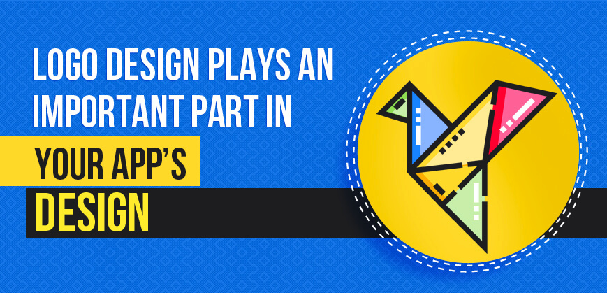
3. Designing A Logo for Your App
If you are a small business who is still shaping up its brand image & identity and lending it a recognizable personality, chances are you have been pondering upon the feasibility of getting a professionally designed logo for your brand.
A logo is essentially a graphic symbol, mark, or maybe an emblem that is used by any entity to help them promote public recognition. It can range from a design that is abstract or figurative or may even include the text of the name that it represents in the form of a logotype or wordmark.
Though rudimentary, this definition of a logo is near accurate! They are an important part of your company and all that it represents. The iconic Nike Swoosh, the yellow arches of McDonald’s, or the three-pronged star logo of Mercedes-Benz are some of the simplest, yet the most well-recognized ones too! Irrespective of where you live or which language you speak, you can simply take a look at the logo and identify the name of the company. The memorability of the logos is such that sometimes even if you do not remember the name of the company, you would recognize the logo simply because of its basic elements like font, shape, or even the colour! That is the magic of a logo.
3.1. Why Your App Needs A Logo?
The brand identity that you have so painstakingly built for your company needs to translate to every channel of promotion and operation. The logo you designed is not merely to be applied to your physical store and website, but also on the hottest channel of promotion today – your mobile app! While you are designing your app, make sure that the logo finds its place in it. If, however, you need reasons why this should happen, let’s help you out with that as well.
3.1.1. Brand Recognition
A logo is an extension of your identity. It has the ability to mark a sort of ownership on all that is yours! When there is a logo on any of your products, promotional material like flyers or free gifts, your website or anything else, it becomes clear that it all belongs to your company. On your app too, the logo is a sign of ownership that you imprint for your audience to see and associate with. Your logo would tell everyone who looks at it, what you are all about, what products you are selling and what kind of value and benefits you would be extending to them.
3.1.2. Lures in New Customers
This is a world of content, imagery, and all things visual. Gone are the days of monochrome and today the audience or the consumers are looking for some of the more interesting designs and colours. An interesting logo that is designed as per the modern tastes and expectations not just attracts a wider audience to your physical place of business, but also encourages them to download your app, explore it, and then convert into a paying consumer as well. A great logo that is displayed on your app would not just draw their attention, but also pique the curiosity of prospective customers nudging them to take a look at the app, and maybe then add to your revenue.
3.1.3. Sets Your App & Company Apart
Let’s say you own a Pizzeria in Brooklyn. Tough competition eh! It’s nothing compared to the millions of apps you are going to be competing on both the prominent app stores. With such a competitive market in the physical world and in the digital space, it is as important as it is difficult to set yourself apart. When you have a logo that sets you apart from the million other logos with big pizza slices and moustachioed chefs grinning back at you, you and your pizzeria is going to stand apart! A good logo on your storefront and your app or website can actually help you make your own name & establish a strong space in the minds of consumers!
3.1.4. Enhances Brand Loyalty
People love familiarity. This is an established fact, and it is quite common for people to find comfort in a logo that they have come to recognize and love. A sense of loyalty for your brand is only strengthened by a logo that the consumers have come to associate with you.
3.1.5. Brings Omnipresence
Your logo is your promotion and advertisement. Wherever you place it, whether it is your packaging, products, social media, website or any place else, a logo can be a great way to advertise your brand and your message unswervingly. A well-developed brand message that is efficiently associated with the brand logo can ensure omnipresence.
3.1.6. Represents Your Business
A logo that is effectively placed on your app would go a long way in representing your business without having to use too many words. A brand logo that is designed to align with the core characteristic traits & qualities of a brand would do well to represent your business in its most accurate sense.
3.1.7. Evokes Emotional Response
Like brand colours, logos also help in developing an emotional relationship with any product or brand. Hence, when you are picking colours for your pizzeria, warm colours or colours of the Italian flag might be a good idea, and when you are selecting the colours for a logo of your high-end stationery brand black, steel grey and white may be great for you to indicate professionalism and sophistication.
If you are looking at designing a logo for your app and for your brand, chances are, you are like most other people who are not expert graphic designers. In this case, it is natural for you to go looking for some kind of help. As a small business owner, it is quite natural that you might not have the resources in terms of time, money and people to dedicate to the development of a logo for your app and your brand. However, that does not mean you can not have a professionally designed logo for your business. There are a great number of online logo makers to your rescue.
4. Designing the Right Splash Screens
While you are designing your own mobile app, you must pay attention to every little detail possible. There are a million things that are important when you are all set to create an app to proliferate your business. Every little detail must be directed towards making a favourable impression on the prospective customers so that they not only remember you for a long time to come but remember you with reverence and fondness.
First impressions in particular matter a great deal when it comes to getting a good number of people who would not just explore our brand-new app, but also convert into loyal customers. This means that when the app users are using your app, the first thing that they come across on it has to have the appeal to attract their attention and to keep them hooked enough in order to ensure that they do not navigate away from your app and take their business elsewhere. On an app, a user would first be exposed to the splash screen and see it every time they launch the app or reboot it.
4.1. What Is A Splash Screen?
A splash screen is a kind of a graphical control element that consists of a window containing an image, a logo, and the current version of the app. The splash screen is typically what you see when you are trying to launch an app, a game, or software.
4.2. Significance of A Splash Screen

A splash screen can offer you one of the greatest opportunities to make an impression on the users about what lies ahead if they decide to go further and explore your app. Only when you are able to make this impression a favourable one, can you sell your products and services to a prospective customer? Hence it is of great significance that you strike the right cord with the app users right from the start. Penguin Apps Builder, with its rich experience, has formulated a list of tips to get you started on designing your very own splash screen that is sure to impress your audience.
5. Tips to Make A Great First Impression with Your Splash Screen Design
Splash screen on your mobile app is more than a mere graphic, it is what your app users would see first! This is the first impression that you are going to make on your prospective customers. You can either make a favourable impression every time they interact with your app and make them want to come back for more, or you can create an impression of someone who is inexperienced and inefficient who could not even design a good splash screen for their app
5.1. Be Creative, Yet Remember to Keep It Simple
The users who would come across your splash screen would not really be spending a whole lot of time on it (hopefully) because you would definitely want them to engage with the internal content, deals, services, offers and myriad other features that you have painstakingly created. Hence, the design of your splash screen must be simple, but that doesn’t mean it should be ordinary. Hence it is important that you let your creative juices flow and explore different combinations of colours, logos, and backgrounds.
Since you already have a logo in place by now, it is a good idea to use and place it at a primary spot on your splash screen. This instantly introduces you as a brand to the app users. However, do not for once think that you can make use of this space to launch into babble about you, your company, the history, or to brag about how you offer the best in industry. Keep the text to an absolute minimum for this part of the app. The fact that you have an exemplary app for your business already is establishing you as a market leader, there is no need to overkill at this point.
However, it is important to understand that humans are inherently visual any kind of graphics or imagery is naturally going to appeal to them. Hence, understand that playing around with different elements is a good idea, quite like the way you would do while designing your website.
5.2. Remember to Accommodate for The Million Screen Sizes in The Market
How many different kinds of mobiles do you think exist today? A big number, right? There are not only a great number of brands, but also quite a great number of models for each. Each of these different model & brand then has its own screen size & resolution. For example, if you were designing a splash screen for iPhone X, and completely forget about all those iPhone users who have been using the older versions, you are offering a less than quality experience to this huge user group. They might be welcomed to your app with a splash screen that might be distorted or disproportionate.
5.3. Put on An Experimental Hat
Like most other first attempts it might so happen that your first design does not fit all the criteria for perfection that you set out with. However, don’t let it get to you! It is of great importance that you experiment with the design of your splash screen by trying out different background colours, logo placement, and placement of any other graphics you might be placing on it.
There are a number of online and offline graphics tools which can help you out in this experimental phase and you can keep exploring, keep designing, and then redesigning your splash screen until you reach satisfactory results.
5.4. Do Not Forget to Have Some Fun
Designing your own splash screen can be a lot of fun! Make the personality of your brand and the company come alive through the design of your splash screen, build an appropriate theme and adopt suitable styling. When you induce your brand’s character into designing your splash screen, it automatically becomes a whole lot of fun and you are filled with that much coveted and anticipated feel-good notion that is typically associated with design. But, even as you are doing this, make sure that you keep your design simple because you don’t want the app visitors to be overwhelmed with any kind of visual clutter on your app.
5.5. Flaunt How Awesome Your Brand Is!
In the past, one of the main ways for the brands to display any message to the customers was through a logo and the motto. A splash screen doesn’t really work well to show off how great your brand is in an appealing & visual manner. You can, instead try and capture the attention of the app users by way of some amazing visuals that showcase the culture, ethics, and the true spirit of the brand.
These visuals might include images of some of your greatest work, the dedicated team that would serve your clients or even a whole set of images that would exhibit what to expect once the users enter the app.
Not everyone is an artist nor is each one of the aspiring app owners a design professional. We all know now how important the first look and appeal of your app is when you are approaching first time user with your brand-new app. The importance of good graphic design for your mobile app cannot be stressed upon enough.
The user interface and the app graphics are essentially what form the first impression on the users who log in to your app for the first time. If the users do not like what they see, they are probably not going to come back to it and use it again. This is the first thing they see, even before beginning to interact with your app, and it needs to be flawless!
While you might not have much of an experience designing graphics for your apps, you can always go for one of the free tools to create app graphics. These tools would help even the most unskilled person with absolutely no understanding of design or skills in handling various design software can make use of these tools and come up with brilliant graphics for their mobile apps.
Like any other industry, design and graphics for apps have their own trends as well. These trends can become your guide when you are going to design your own app graphics, and when you follow the trends, you tend to engage the users a lot more effectively.
Why should you follow the trends while designing the graphics for your app?
When you follow the trends, you satisfy the aesthetic expectations of your clients. The apps that look outdated are often tougher to use and the users tend to grow bored of it, abandoning it in some time. Hence, following the latest trends in designing app graphics will not just make your app look good, but will also keep it relevant for the whole user group.
- Impact on Mood
We have talked earlier about the effects of colour on the psyche and thinking of the customers or any other users who are exposed to it. So, when you are using the colours on your app in the right way, you have the ability to either aggravate the users or help them stay calm and at peace with themselves. The idea though is to make the users smile and feel at ease when they encounter the app for the first time and every time after that. Any design that looks great is bound to engage the audiences or the users for a longer period of time and retain their attention. - Build Trust
It is only natural that people would put more faith in an app or product that looks better and has a polished design thought invested in it. When the app is designed in a professional manner, it sends out a subtle message to the user that the app owners are paying attention to the way their app appears to the users, hence they would also pay attention to the products and services they are offering. - Ease of Use
A good design ensures that the interfaces on the app are clear and precisely ordered. This makes the app and the processes involved in it, easy to cope with. This reduces the need for manual actions, which then saves the users’ time, making your app easy to use.
6. Top Trends to Follow While Designing App Graphics
Penguin Apps Builder has been involved in mobile app development for a very long time and has garnered a great amount of experience. With this experience and the expertise of their dedicated staff, we have collated a list of mobile app graphic design trends that can act as your guide as you step towards building your own mobile app.
6.1. Vibrant Colors
One of the most powerful tools in the designer’s toolkit is the colour they choose to use, the right colour can help you draw the attention of a prospective customer, induce a favourable emotion, set a desirable mood and impact their actions as well.
In 2016, the UI designers went back and rediscovered the delights and simplicity of using flat designs in mobile apps. Also, they shifted their attention on offering a greater personalization with various design elements.
One of the first apps to tweak their logo, Instagram revamped its realistic yet dull coloured logo and brought on a vibrant logo with a flat design and perked it up. There were immediately a number of brands who joined the trend and the trend were reaffirmed.
In 2018, this trend is still going strong with a lot of vibrant colours coming in and inducing warmth, energy & subtleties to your app. This is the time for you to go and explore some great new colours, but even as you are doing that, make sure that you choose wisely and apply them with care. The chosen colours must enable you to create unique and strong graphics that are easy on the eyes.
6.2. Videos
Content in the form of videos rose to fame in the year 2017. As per HubSpot’s research 78% of the people watch online videos every week, and more than 55% of people watch online videos every day! In 2018, the app designers would have to adapt to the video formats in mobile apps.
The attention span for humans has come down from 12 seconds to 8 seconds today. It is to cater to this change in attention span that has brought about the emergence of UI based on videos. In 2018, video content has gained traction and becomes a lot more important than photo or text content. Sharing videos is super easy which means that the content has the capability to go viral.
It is important that the videos that you create maintain the same tonality as your mobile app so that they are in harmony instead of clashing with each other. As 2018 progresses, more of the video-based content would become prevalent, and as a designer, you would have to plan the app graphics keeping this in mind.
6.3. Overlapping Effects
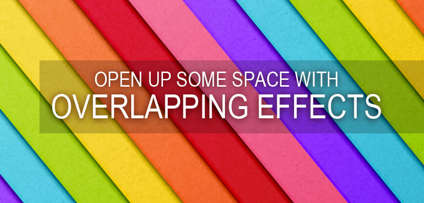
Overlapping of fonts, graphics, and colours make the design of the app more eye-catching & distinctive while creating a sense of space. It is for this reason that overlapping of different elements of app graphics has come to be used quite popularly by the designers in recent times.
Overlapping different elements and combining them with shadows making the whole mobile app interface design a lot more impressive. It is for all these reasons and for the sheer pleasure of looking at them that the trend of overlapping visual elements has emerged as a big one in designing app graphics.
6.4. Gradient Transitions
It has been a few years now, that the designers have been adopting colour gradients in their design works. This trend has translated on to the logos, buttons, & backgrounds or splash screens in the mobile apps. Along with a vibrant colour palette the use of gradients has emerged as a strong trend.
This is because of a simple reason that when you choose one particular colour, you have the ability to exhibit an entire hierarchy while drawing a picture and using it in combination with various other graphics and numerous colour gradients.
It is this sense of hierarchy that has led to the colour gradients that led to their emergence as a strong trend in 2017 and a continuing trend for mobile app graphics in 2018 as well. In 2018 though the trend will be connected with an effortless transition from one gradient to the other during a particular action.
6.5. Opacity
Making adjustments to the transparency or the opacity of the same constituent elements of a design can bring about different effects to the graphic. Hence when you are designing different constituent elements of the app graphics, you can set different opacity levels and come up with some excellent design work.
This technique, when applied on different coloured elements in the app graphics, can be used to create some brilliantly colourful glass texture creating unique app interface components. This is why this technique has been widely used by most designers working to develop unique mobile app logo designs.
It doesn’t matter which method or tool you use to add this opacity effect to your mobile app graphics, setting varying transparency or opacity levels for different elements will definitely create a positive impact on the app users.
6.6. Typography
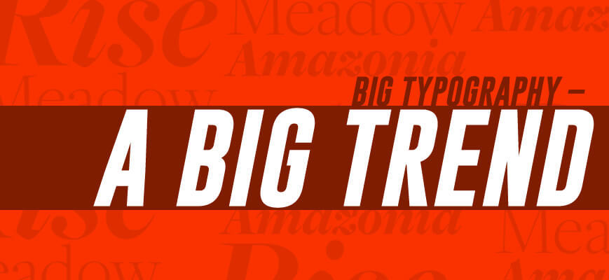
In mobile app graphics, one of the biggest trends to emerge this year is the use of big headlines and massive sized fonts combined with smooth animation. This year when you set out to design your mobile app graphics, you have a great scope in exploring typography in order to create some uniquely personalized app graphics. Typography when cohesively combined with different images, videos, colours, animations, and unique layouts, offers excellent user experience.
Typography is one of the most crucial elements in the mobile app graphic design field and can help you bring about a change in the traditional font styles and add a touch of experimentalism and creativity to it. You can go a little fancy this year with the font styles and finally step away from all those fonts that have already been done to death, thus giving you a space to play around with the aesthetics of your app graphics.
6.7. Cards
It has been quite a while that mobile devices surpassed PCs to become the most used tool for browsing the web and for carrying out a myriad of online activities. In order to bridge this gap between using a desktop and moving on to mobile apps, there was a need for an element that is compatible with both platforms. Cards are one such element. Though this might not be one of the most innovative trends in mobile app graphic design, they play an instrumental role in curating an excellent mobile app graphic design. Cards have everything including video, photo, and link to a particular subject, thus becoming one of the most ingenious ways to display and bring together a significant amount of content on screen.
These cards are not just aesthetically pleasing, but also easier to assimilate and suitably optimized for clicks & taps. All this and more has made cards as the prime UI design mode in leading apps including but not limited to Pinterest, Netflix, Newsfeed & more.
6.8. Responsive Logos
It is due to the dynamism and perennial evolution in the world of mobile app graphic design, that now logos are being modified in order to make them compatible with the huge number of devices in the market. Today the brands have started refreshing and redesigning or redefining their logos to make them more simplified and modern versions, especially since the past few years. In their journey of evolution, the next logical phase is making the logos responsive in order to meet the modern user’s demands.
6.9. Real Life Photography
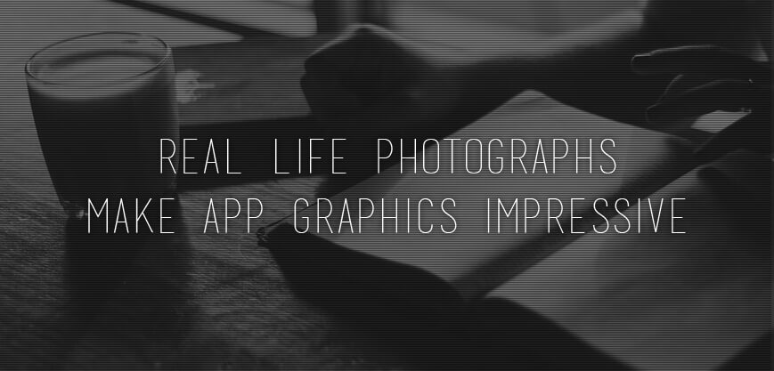
Real life photographs bring about an element of energy and dynamism to bring in authenticity, which is why real-life images come back to the mainstream mobile app graphic design. It was in 2017 that the real photos rose to fame in a big way, and in 2018 it is only going to get bigger. As the brands are looking for ways to strengthen their relationship with users and designers are trying to unload the tawdry stock photos they have been holding on to for this long, everything points towards the return of real-life photographs as a strong element in mobile app graphic design.
6.10. Highly-detailed Vintage
Vintage aesthetics have been around for quite some time now, but the usage of highly-detailed vintage is only going to grow stronger in the year 2018. Today, the mainstream need might be for minimalism, but in contradiction to this, finely crafted images are classic and timeless and are all set to shoot their way up to fame. As modern-day brands are looking towards attaining top-shelf expression that represents elegance and excellence, the trend of using highly-detailed vintage images is only apt for this year.
Though this trend might not suit every industry, the food and beverage industry, especially the organic foods and wines would do well to leverage this particular style.
6.11. Emoticons
One thing that we can all expect to see this year is the integration of emotional intelligence into the mobile experience to a greater extent. This is now not just limited to adding some animated effects once the user has successfully accomplished a task with the app. The emotional intelligence aspect has become one of the mainstream aspects that is specifically leveraged to make the user experience a lot more pleasant & engaging.
There would be an addition in the list of emoticons on your average app. The emoticons this year would be integrated into unique ways with elements of face recognition so that they can be used to provide a whole new array of reactions. Currently, Animoji is one of those technologies that have been doing this quite perfectly. This is effectively an animated emoji that responds to the camera’s facial expressions on iPhone X.
6.12. Borderless Display
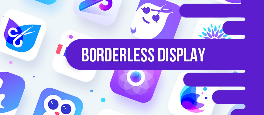
This is one more trend that Apple is responsible for. When the iPhone X was launched with a borderless display, it did manage to put out some ripples that travelled far and wide, especially among the UI designers. They were the ones who brought about the trend of transforming the use of strict flat design ideas in mobile apps which brought about a certain fluency in the modern-day storytelling.
Designs specific to Borderless Displays were quite a bit restricted in the last year, but this year, it is only going to come up higher in the hottest design trends for mobile app graphics. It might be time for us to anticipate the advent of designs that would cover the whole mobile from edge to edge!
6.13. Simple Curves & Geometries
There was a time when most of the UI designs had a complicated and changeable style to it and that thankfully has passed. Today most of the designers have adopted a simpler and a lot more natural style in the design of a mobile app graphics.
This means that in place of an interface that has plenty of colours, graphics, buttons, images, videos, animations, or any other complicated elements, phone interfaces that have simple curves, clean geometries and buttons would have more of a positive impact on the app users. It is, therefore, time now to clean up the design and focus heavily on the functions & features of the app.
6.14. Strong Font Colors for Better Readability
Use of stronger colours for the fonts or font contrasts can help the designers create some brilliant app graphics and UI designs that would attract the attention of an appeal to a greater number of users. Using different styles, types, sizes or order of fonts can help you create a design with a defined sense of hierarchy and space. The use of colour in the right manner can help you create sharp contrasts so that the design you finally make is visually appealing and a lot more colourful.
6.15. Custom Illustration
This is a trend that emerged last year and is only going stronger this year. When the mobile application interface makes use of unique illustration styles, for example, hand-drawn illustration, the simple style illustration, paper cut style, or the illustration styles inspired from famous paintings, the whole app experience is raised up by quite a few notches. Using these different custom illustrations make your applications while setting them apart from the others and giving your app a distinct personality and a flavour that the users will remember and want to come back to interact with.
These trends can act as your guides as you are on your way to design the graphics for your mobile app and can help your app look like it belongs to the industry while helping your targeted users connect favourably with it.
Further, to help you get working and designing the graphics for your mobile app, we have put together a fabulous list of quick tips that would help you create the same results as a professional designer.
7. Quick Tips for Designing Mobile App Graphics
It is natural for most experts to assume that the things they know must be obvious to most people around them, and sometimes it is important that they are reminded that it is not true. They have a whole lot of experience that helps them create excellent work in a much shorter time. In doing so, they are consciously or subconsciously sticking to a certain set of rules or guides to prompt up their design decisions. These rules can be turned into a list of quick tips for the design novices to design their own graphics.
The quick tips listed below have been collated by the experienced team of designers at Penguin Apps Builder who have brought together their collective expertise to help you build an app that looks as good as it functions when built with our app builder.
7.1. The Invisible Grid Guide
When you are designing the graphics for a mobile app, you need to be aware of the fact that there is an invisible grid on the surface. While it may not be visible to the naked eye, but the grid does exist on every surface and is the guide for you when you set out to design.
7.2. Spacing & Placement
As you begin working on the working surface whether it is a canvas, monitor, or any other screen that you choose to work on, the moment you inscribe anything on it be it a dot, a line, a word, or anything else, you immediately define the margins and padding of your work area. Any mark that you make, or any element that you place defines the working space you have.
Now that you know this, remember to maintain uniform width and height of margins & padding. You can’t have 10 pixels in one place while the other enjoys a bountiful 70 pixels.
7.3. Create A Hierarchy with Colors
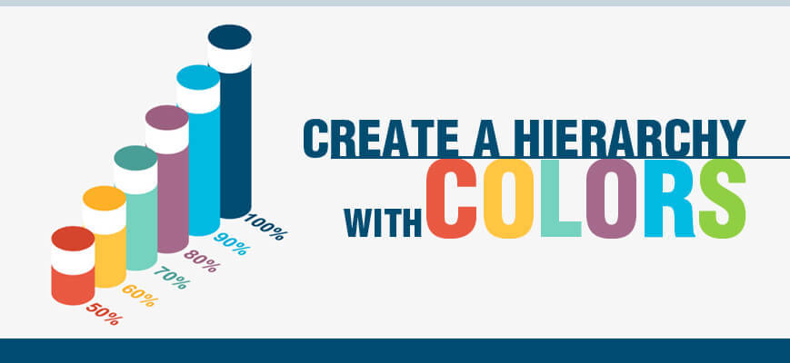
The colour value is of great importance while designing app graphics as they represent an intent. In greyscale, for example, if you were to use three successive elements one in black, another in dark grey, and the third one in light grey, you are conveying that the first element is the most crucial one for you as a visitor, the second element is fairly important, and the third one is the least important.
These decisive elements should ideally not be the same colour as the app, because the lightest element might fade away completely. Also, while deciding the colours of elements refrain from using red for positive actions as the red colour represents danger or stop in most cultures. So yeah, colour psychology has a role to play even here.
7.4. Choose Suitable Brand Colors
Everyone has their personal likes and dislikes and it is natural to want to paint your app in your favourite colour. However, what if your favourite colour was Pink and you were designing an app for an auto-parts dealership! Not a great idea, right? A brand needs to be focused on the emotional relationship that they can build between their customers and the products or services that they have on offer.
As we learned earlier there is a deep impact of the choice of colours for your app on the app users who are interacting with the app. This means the colours that you choose for your app need not be your favourites, they simply have to lend your brand the ability to forge an emotionally favourable relationship with the intended consumers or customers.
7.5. Know Your Color Hues, Tints, & Shades
How many times have you referred to Pink as a shade of Red? If you have done that even once, it is time you learned your colours and the associated terminology, now before getting into designing. Hues are the base colours like Yellow, Red, Blue Green etc. When you add black to any of the colours, you get a shade of the colour, and when you add white, you get a tint of that colour. So, Pink is a tint of Red and Maroon is a shade of Red, and none of them is both, a tint and a shade. So, you may have been using nomenclature like Canary Yellow, Sky Blue, Rose Red, Plum Purple, and many such others, but when you are speaking technically use the correct nomenclature.
7.6. Keep That Logo Updated
It’s true that a logo alone is not going to make your business a great success, but if you have a logo that is poorly executed or is out of style, it is definitely going to give you a poor brand image.
We have often heard people say that a logo should be timeless and that it should stand the time of the test. This is one of the biggest myths in design. Design by nature is trendy and evolving, which means that nothing we design can be timeless! Logos tend to be stuck in the time that they were created in. For example, if we were to talk about Coca Cola, the logo does not have a modern feel but looks like something from the 1920s, which is when it was originally designed. The logo has evolved most certainly with time, but still has a certain vintage look to it.
7.7. Create Elements for Repeat Usage
There would be some elements on your app that would be present on numerous screens. For example, if you have an Orange coloured “Start” button, it should be the same colour, style, dimensions, and type everywhere. So, create the sample button or any other repetitive element and lock it. This element then can be replicated on all screens everywhere, thus maintaining consistency.
7.8. Use Smart Ways to Separate Text & Create A Hierarchy
There are a number of ways to do this, and some of the smartest ways include using the capital case, using indents, contrasts, or an underline. These choices are all stylistic in their nature. It would be unfair to say that one is better than the other in bringing about an impact, but the idea is that there should be consistency in the way you are using the elements. This means that if you choose to use underline, continue using it all through the app instead of mixing it all up and confusing the users.
7.9. In with The New, Out with The Old
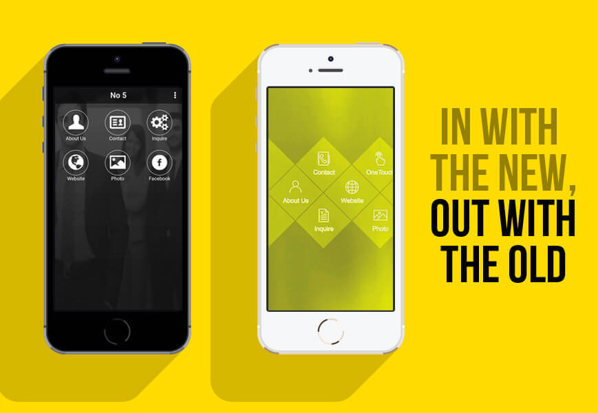
We have talked about design trends earlier. It is important that when you set out to design mobile app graphics, you follow the latest design trends. One of the trends being followed today is the flat design. Ignoring the trend and incorporating a skeuomorphic trend is going to tell your targeted users that you are not tuned in to what’s new!
7.10. Let Your App Look Like More Than A Mere List
Almost all the apps (apart from gaming apps) are essential means to navigate through a list of one kind or another. It is through clever app graphic design that you can hide this list and distract the users from the fact that the app they are using is just another list and make the whole experience interesting, rewarding, and fun. It is for this reason that proper hierarchy takes on a great amount of importance. When you have the right foundation, you can greatly vary the layout yet convey the same foundation.
7.11. Going Fancy Fonts
While deciding upon the font that you are going to use, it is important that you think about whether this font can easily be used on mobile, does it offer you variety in terms of weights (when you want to create a hierarchy), and whether the font is legible!
Not many people can distinguish even between the most commonly used fonts and all they need to have in front of them is a fairly clean and legible font.
However, when you are thinking about focusing on the brand, you can think about going for more complex or fancy fonts that are more valuable for their aesthetics than usability. So, if your brand should have a bit of spunk, a tad bit of whimsy, or Victorian grace, it can all be done through a fun font that you pick out. However, this again is optional and not a mandate, a bit is one of those things that make your app go from “good” to “great”!